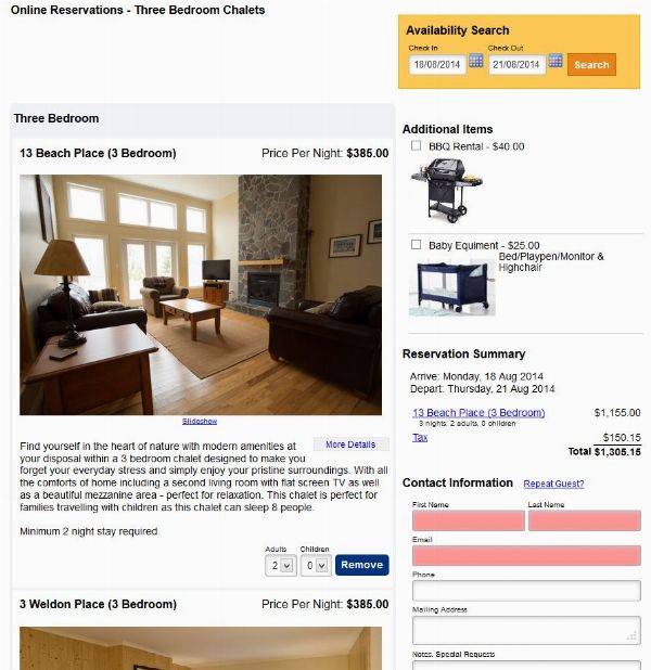
We’ve update our “Simple” themes to reflect trends in modern web design. Most noticeable are some brighter colors, larger text, and larger form fields. But we’ve also added responsive design into these themes, meaning that the page formatting automatically adjusts to fit the user’s screen, no matter what size. This means it isn’t critical to have a separate theme for mobile devices and web. Instead it is possible to just use one self-adjusting theme that can work across all devices.
These themes are:
Simple 2014
Simple, Reversed 2014
Simple, Narrow 2014
In full screen (such as on a desktop browser) the system shows two columns side by side.

On narrower screens, such as a phone, the system becomes one column. Images automatically resize to be narrowed, as necessary.
