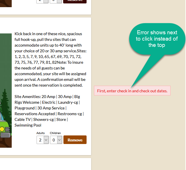
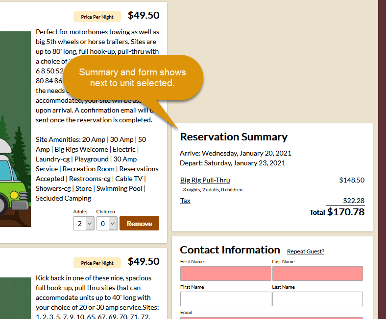
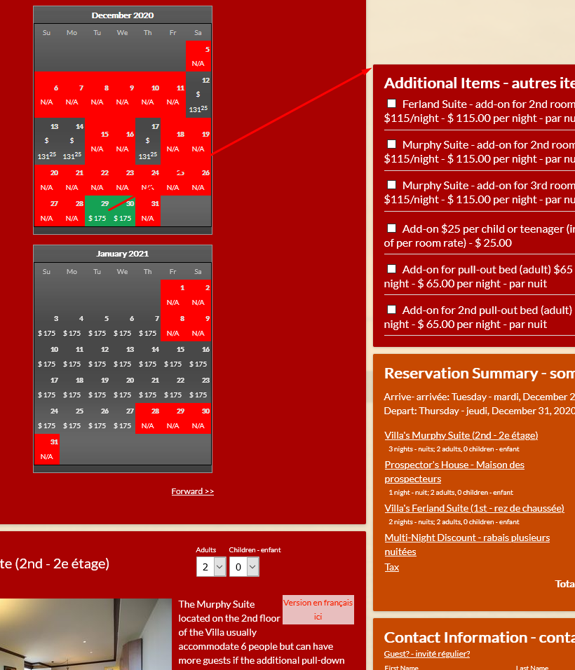
A feature long on our list, to have the contact form appear next to the room/unit selected, has now been completed. This is very handy for our clients that have a long list of rooms (or apartments, vehicles, cottages, etc.), where the guest may be selecting from the availability below where the reservation form starts. Now, the form will move down automatically to the spot on the reservation page where the unit was selected.
Of course, this only is necessary for users with a screen large enough to show the system in two columns (such as a desktop monitor). For narrow devices (such as a phone), the reservation form continues to show below the availability.
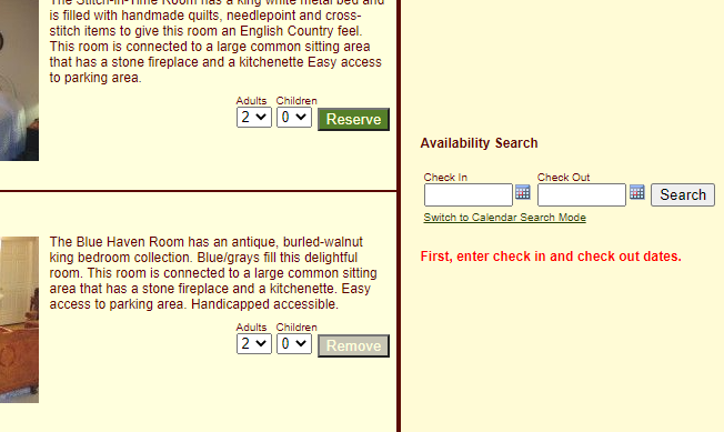
Another nice side benefit of this feature, is that the error message also shows next to the unit clicked. Rather than up at the top of the page, potentially above the viewable area of the guest’s screen.
Here are a few screenshots to show how this works. As always, any feedback is welcome.


Works great for hotel style pages, multiple units, and single unit pages.

