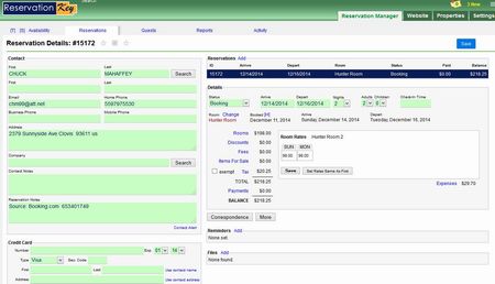
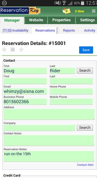
We’ve rewritten the underlying code for the Reservation Details page so that it is now using a responsive layout rather than a fixed layout. This means that the layout of the page will automatically change based on the user’s device screen size. Instead of being a fixed width of 1000 pixels, now the elements on the screen will re-position themselves to best fit whichever size screen is being used. As we see more and more mobile devices being used, often with smaller screens than for what the system was originally designed for, it is important that we rework the layout of our screens so that the system is also easy to use on small screens.
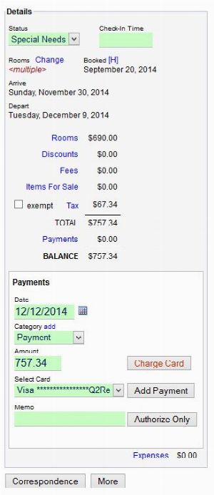
When viewed full screen on a “desktop” computer the layout should mostly look the same. But when the screen is made much narrower, what was traditionally in the right side column now moves below the left column and the entire page is one long column.
If things don’t look quite right at first, press Ctrl-R or reload the system in order to make sure you are seeing the newest files we have loaded. This has been tested on a variety of browsers and devices, but sometimes things still don’t look right. If you notice anything unusual feel free to comment here (and post a screenshot if possible).
Full Screen:

Narrow Screen:

